#Don't know if I'm using all of these, but including theme here anywayslibrary(tidyverse)library(rio)library(here)library(easystats)library(patchwork)#Remove Scientific Notation options(scipen=999)
Regression
3 main reasons for using regression:
As a description (what is the average salary for men and women?)
As part of causal inference (Does being a woman result in a lower salary?)
For prediction (“What happens if…” questions)
Regression
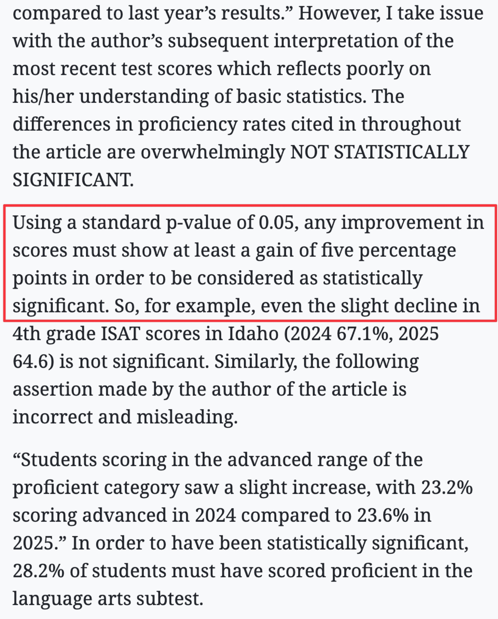
Overall, we are providing a model to give us a “best guess” on predicting our outcome
\[ Y_i = b_0 + b_1X_i + e_i \]
Explaining Variance
Explaining Variance
Explaining Variance
Model Interpretation
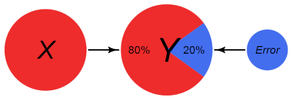
Once we have a model, we will be able to interpret the coefficients. For a bivariate regression, this was fairly straightforward
We would look to the beta (effect size) and interpret it as: for every 1 unit increase in our X variable, there will be beta units increase in our Y variable.
Regressions
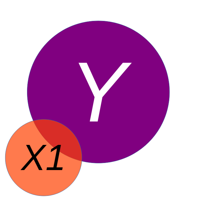
We may want to include additional predictors into our model to best explain the variance in an outcome:
We have been contracted by the county to examine their Fire Department. We have been provided with the data below, and asked to examine what may be related to how expensive a fire costs.
Code
# --- Step 1: Simulate the Data ---set.seed(123) # for reproducibilityn <-300# number of fires# Create three distinct groups for fire sizefire_sizes <-sample(c("Small", "Medium", "Large"), n, replace =TRUE, prob =c(0.4, 0.3, 0.3))# Simulate our variables based on fire sizefire_data <-tibble(size =factor(fire_sizes, levels =c("Small", "Medium", "Large"))) %>%mutate(# The bigger the fire, the more trucks are sent.num_trucks =case_when( size =="Small"~round(rnorm(n(), 2, 0.5)), size =="Medium"~round(rnorm(n(), 5, 1)), size =="Large"~round(rnorm(n(), 9, 1.5)) ),# For a given size, more trucks -> less damage (the true effect)# But bigger size -> more damage (the confounding effect)damage_amount =case_when( size =="Small"~20-2* num_trucks +rnorm(n(), 0, 5), size =="Medium"~80-3* num_trucks +rnorm(n(), 0, 8), size =="Large"~150-4* num_trucks +rnorm(n(), 0, 12) ) ) %>%# ensure no negative valuesfilter(num_trucks >0, damage_amount >0)
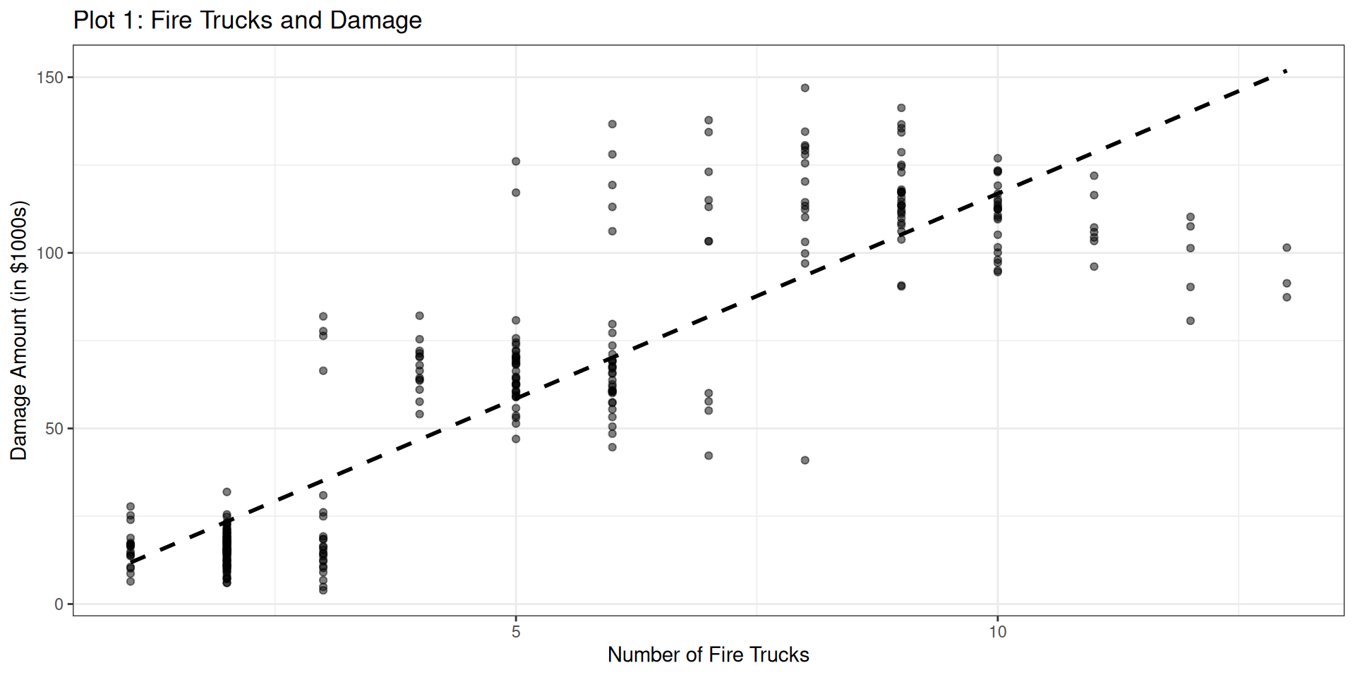
Let’s start by examining the relationship between # of firetrucks and the damage of the fire
Code
ggplot(fire_data, aes(x = num_trucks, y = damage_amount)) +geom_point(alpha =0.5) +geom_smooth(method ="lm", se =FALSE, color ="black", linetype ="dashed") +labs(title ="Plot 1: Fire Trucks and Damage",x ="Number of Fire Trucks",y ="Damage Amount (in $1000s)" ) +theme_bw()
Bivariate relationship
This relationship can also be represented by a correlation, or a regression
    Pearson's product-moment correlation

data:  fire_data$num_trucks and fire_data$damage_amount
t = 32.093, df = 298, p-value < 0.00000000000000022
alternative hypothesis: true correlation is not equal to 0
95 percent confidence interval:
 0.8524507 0.9037853
sample estimates:
      cor
0.8806778
## ORfire.lm1 <-lm(damage_amount ~ num_trucks, data = fire_data)summary(fire.lm1)
Call:
lm(formula = damage_amount ~ num_trucks, data = fire_data)

Residuals:
    Min      1Q  Median      3Q     Max
-64.534 -10.946  -3.153   9.694  67.540

Coefficients:
            Estimate Std. Error t value            Pr(>|t|)
(Intercept)   0.1458     2.2072   0.066               0.947
num_trucks   11.6731     0.3637  32.093 <0.0000000000000002 ***
---
Signif. codes:  0 '***' 0.001 '**' 0.01 '*' 0.05 '.' 0.1 ' ' 1

Residual standard error: 20.15 on 298 degrees of freedom
Multiple R-squared:  0.7756,    Adjusted R-squared:  0.7748
F-statistic:  1030 on 1 and 298 DF,  p-value: < 0.00000000000000022
Bivariate relationship
Based on the visualization, the correlation and the regression, what would we conclude from this analysis?
Bivariate relationship
Based on the visualization, the correlation and the regression, what would we conclude from this analysis?
A linear regression was used to examine the impact of number of trucks on the scene and the amount of damage that was done by a fire. The number of trucks positively impacted the damage done by the fire (b = 11.67, p < .001), suggesting that as more trucks are present, the fire does more damage.
Would we be able to say that # trucks causes the damage? Therefore, our suggestion to the county would be to send less trucks to each of the fires. Case closed
Another Side Quest: Directed Acyclic Graphs (DAGs)
Drawing your statistical models and theory can always be beneficial. Dr Haraden should be drawing things on the board
Fire Data: Multivariate Relationship
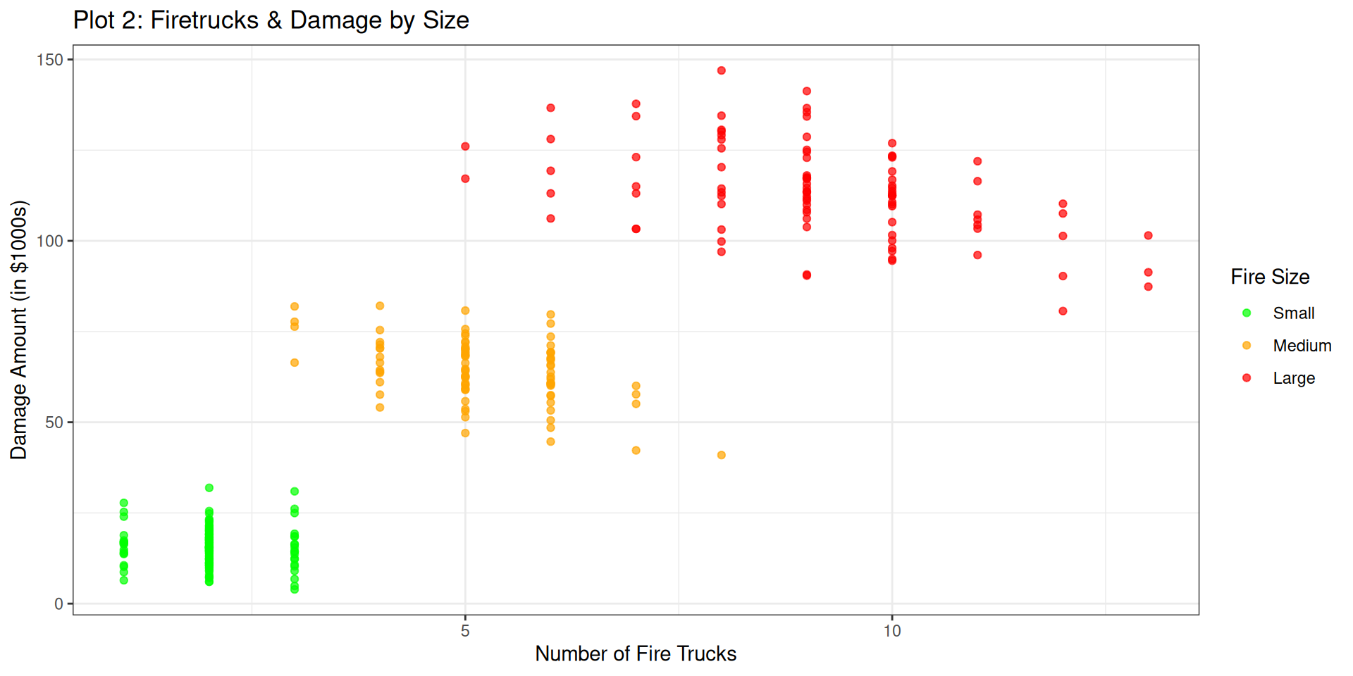
There is a third variable that we haven’t incorporated. Let’s take that information into account when we are looking at the visualization:
Code
# Plot 2fire_data %>%ggplot(aes(x = num_trucks, y = damage_amount, color = size)) +geom_point(alpha =0.7) +scale_color_manual(values =c("Small"="green", "Medium"="orange", "Large"="red")) +labs(title ="Plot 2: Firetrucks & Damage by Size",x ="Number of Fire Trucks",y ="Damage Amount (in $1000s)",color ="Fire Size" ) +theme_bw()
Fire Data: Multivariate Relationship
That seems to make more sense. Let’s add in the lines of best fit too
Code
# Plot 3: The "Controlled" Relationship (Simpson's Paradox)fire_data %>%ggplot(aes(x = num_trucks, y = damage_amount, color = size)) +geom_point(alpha =0.5) +# Fit a line FOR EACH GROUP to show the true relationshipgeom_smooth(method ="lm", se =FALSE) +labs(title ="Plot 3: The Controlled Relationship",x ="Number of Fire Trucks",y ="Damage Amount (in $1000s)",color ="Fire Size" ) +theme_bw()
Call:
lm(formula = damage_amount ~ num_trucks + size, data = fire_data)

Residuals:
     Min       1Q   Median       3Q      Max
-23.7451  -4.6995  -0.2433   4.4801  29.3847

Coefficients:
            Estimate Std. Error t value             Pr(>|t|)
(Intercept)  22.5340     1.1616  19.399 < 0.0000000000000002 ***
num_trucks   -3.4136     0.4328  -7.886   0.0000000000000604 ***
sizeMedium   59.5122     1.8224  32.656 < 0.0000000000000002 ***
sizeLarge   122.3535     3.2873  37.220 < 0.0000000000000002 ***
---
Signif. codes:  0 '***' 0.001 '**' 0.01 '*' 0.05 '.' 0.1 ' ' 1

Residual standard error: 8.431 on 296 degrees of freedom
Multiple R-squared:  0.961, Adjusted R-squared:  0.9606
F-statistic:  2430 on 3 and 296 DF,  p-value: < 0.00000000000000022
Now we can write it up
Fire Data: Formal Writeup
“The current set of analyses sought to examine the influence of the number of firetrucks on the scene and the amount of damage that a fire caused, controlling for the size of the fire. The number of firetrucks present were regressed on the damage amount (in \$1,000s) and the size of the fire. The overall multiple regression was statistically significant ( \(R^2\) = .96, p < .001), and the two variables (Number of Trucks and Size of the Fire) accounted for 96% of the variance in damage done. Each of the two independent variables also had a statistically significant effect on damage (p’s < .001). The number of trucks was negatively related to the amount of damage done (b = -3.41), meaning that for each additional truck that was on the scene, there was a $3,410 reduction in damage, controlling for the size of the fire. Additionally, the size of the fire increased the amount of damage at Medium (b = 59.51) and Large (b =122.35).”
Reporting Standardized or Unstandardized?
INTERPRET b:
When the variables are measured in a meaningful metric
To compare the relative effects of different predictors in the same sample
INTERPRET β:
When the variables are not measured in a meaningful metric
To compare effects across samples or studies
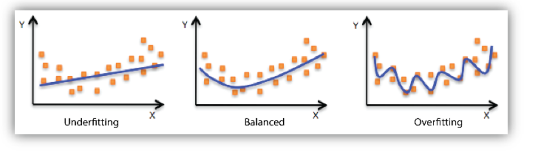
Goldilocks Problem
Models that are underfit, overfit or just-right
Another Example: Computer time & Frustration
Code
# Step 1: Simulate the Data n <-150# Number of students# Simulate total daily computer use in hourscomputer_use <-rnorm(n, mean =6, sd =1.5)# Simulate hours spent on stats homework, now as a whole numberstats_homework <-round(0.7* computer_use +rnorm(n, 0, 1))# Ensure no negative values after roundingstats_homework[stats_homework <0] <-0stats_homework[stats_homework > computer_use] <-1# Simulate frustration level (driven mostly by stats homework)# Scale of 1-100frustration <-10+ (2* computer_use) + (8* stats_homework) +rnorm(n, 0, 10)# Create a dataframe and clean up any impossible valuesstudent_data <-tibble(frustration = frustration,computer_use = computer_use,stats_homework = stats_homework) %>%filter(frustration >0, computer_use >0)# Bin the 'stats_homework' variablestudent_data <- student_data %>%mutate(stats_homework_bin =cut(stats_homework,breaks =quantile(stats_homework, probs =seq(0, 1, by =1/3)),include.lowest =TRUE,labels =c("Low", "Medium", "High")) )
We have collected data on graduate students and their weekly frustration levels. Data that were also collected included the amount of time they were spending on their computer as well as the amount of statistics homework that they had.
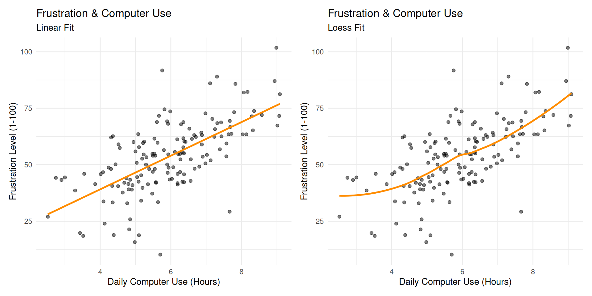
Frustration Model
Taking a bivariate look at things, we might have an initial model like this:
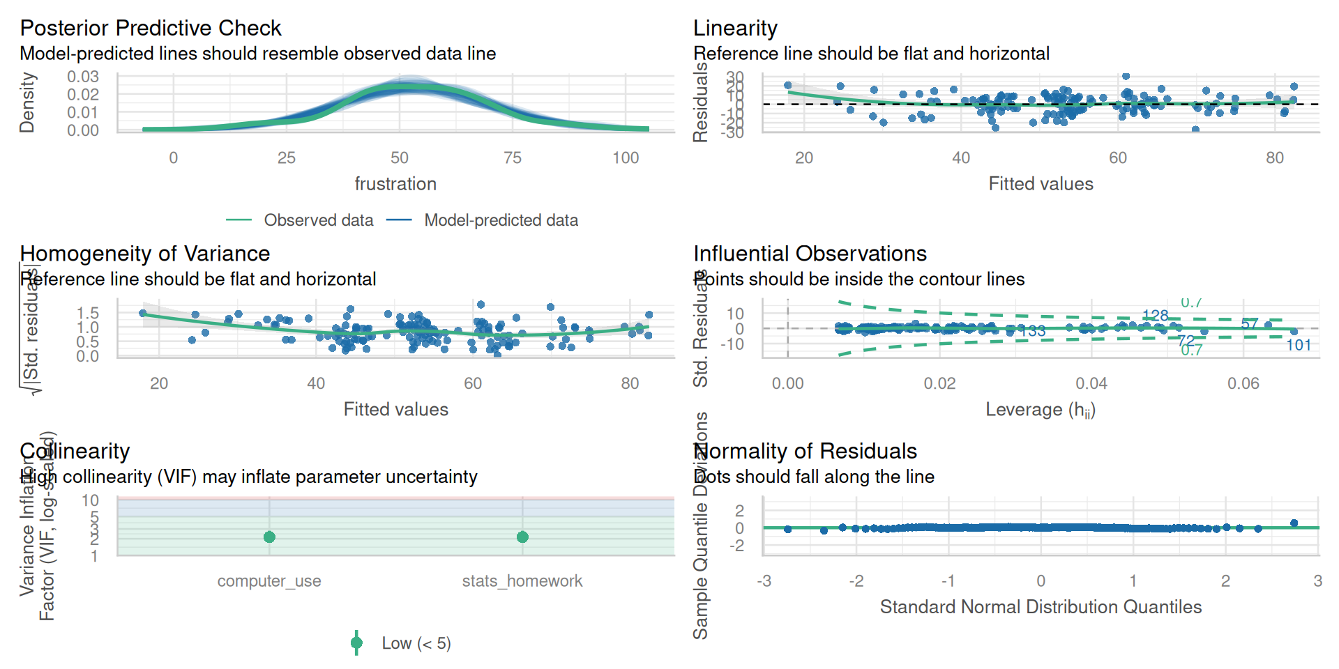
Linearity - A linear relationship exists between predictors and outcome
Multicollinearity - The variables are minimally related to one another (VIF)
Independence of Observations - Each observation in the model is independent of one another
Homoscedasticity of Residuals - Residuals have constant variance across all points of the model
Multivariate Normality - Residuals of the model are normally distributed (QQ Plots)
All of these are checked when using check_model() within the easystats library
Frustration Model: lm()
frus.lm1 <-lm(frustration ~ computer_use, data = student_data)summary(frus.lm1)
Call:
lm(formula = frustration ~ computer_use, data = student_data)

Residuals:
    Min      1Q  Median      3Q     Max
-41.546  -7.090  -0.833   6.922  39.571

Coefficients:
             Estimate Std. Error t value            Pr(>|t|)
(Intercept)    9.3538     4.3697   2.141              0.0339 *
computer_use   7.4389     0.7171  10.373 <0.0000000000000002 ***
---
Signif. codes:  0 '***' 0.001 '**' 0.01 '*' 0.05 '.' 0.1 ' ' 1

Residual standard error: 12.16 on 148 degrees of freedom
Multiple R-squared:  0.421, Adjusted R-squared:  0.4171
F-statistic: 107.6 on 1 and 148 DF,  p-value: < 0.00000000000000022
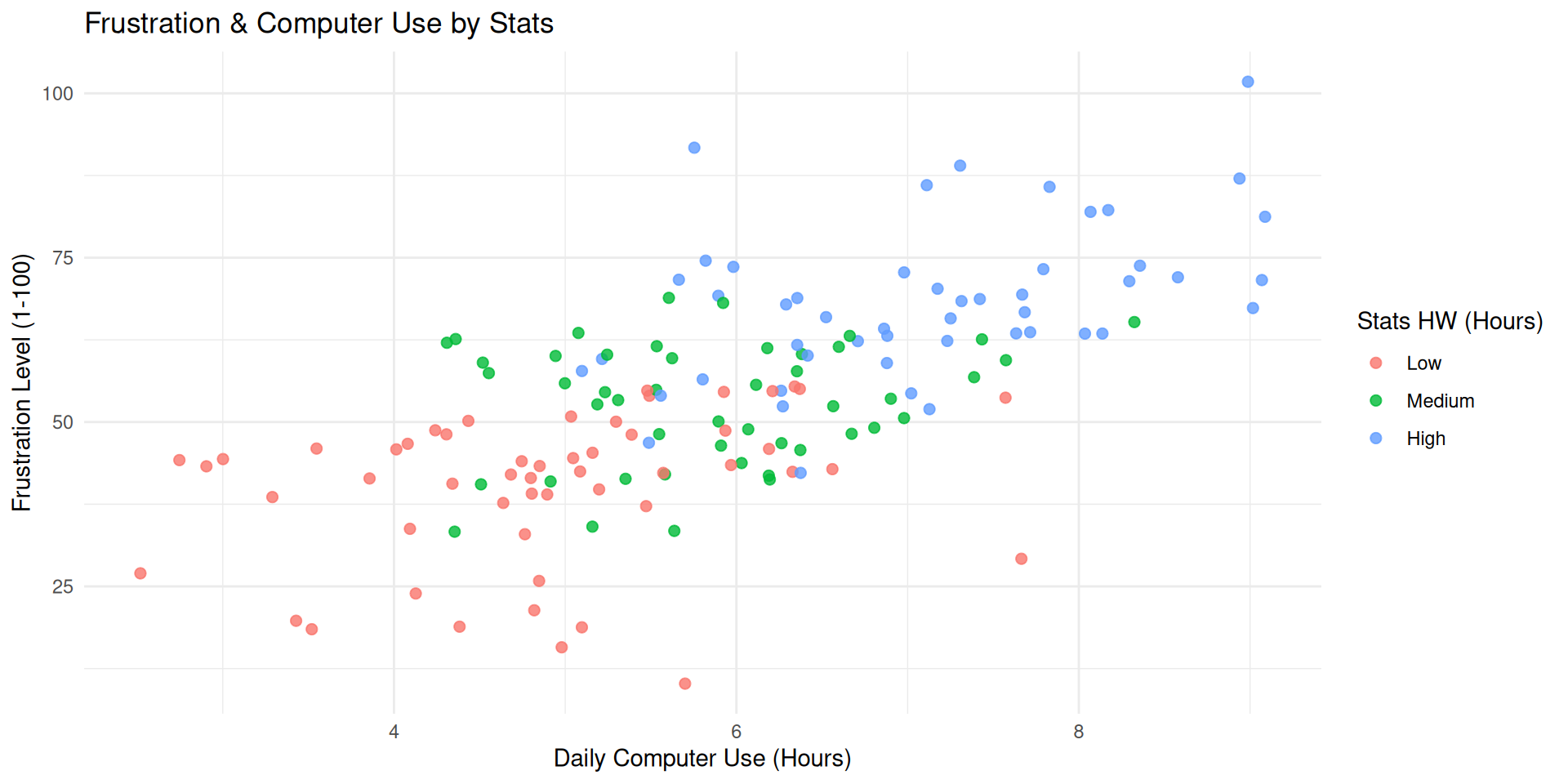
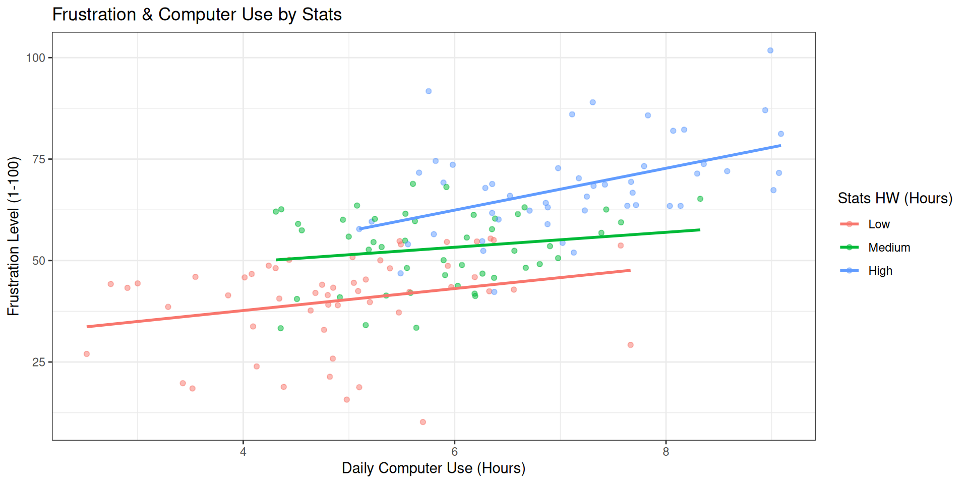
Frustration Model: Multivariate
Code
ggplot(student_data, aes(x = computer_use, y = frustration, color = stats_homework_bin)) +geom_point(alpha =0.8, size =2) +labs(title ="Frustration & Computer Use by Stats",x ="Daily Computer Use (Hours)",y ="Frustration Level (1-100)",color ="Stats HW (Hours)" ) +theme_minimal()
Frustration Model: Multivariate
Code
student_data %>%ggplot(aes(x = computer_use, y = frustration, color = stats_homework_bin)) +geom_point(alpha =0.5) +# Fit a line FOR EACH GROUP to show the true relationshipgeom_smooth(method ="lm", se =FALSE) +labs(title ="Frustration & Computer Use by Stats",x ="Daily Computer Use (Hours)",y ="Frustration Level (1-100)",color ="Stats HW (Hours)" ) +theme_bw()