Figures: Using ggplot2
PSYC 640 - Fall 2023
Last Class
- Comparing Means: \(t\)-test
- Independent Samples \(t\)-test Review
- Paired Samples \(t\)-test
Looking Ahead
Plan to have 2 more labs that will be similar to the last lab
- Likely take place on 10/25 and sometime the week of 11/13
Outside of these labs, I am going to plan on having additional mini-labs
- Likely to take place on 11/1, 11/22 and 11/29 (will update based on how things are going in class)
Today…
Working with ggplot2 to get some really fancy visualizations!
Maybe integrating some generative AI (ChatGPT) to help us out too
Take a look at the data
Will be using a dataset from the palmerpenguins library (link) which is a dataset about…penguins. This function will pull that data into our environment:
Now we can get some descriptive statistics:
Code
# A tibble: 3 × 6
  species   mean_flipper mean_mass std_flipper std_mass cor_flip_mass
  <fct>            <dbl>     <dbl>       <dbl>    <dbl>         <dbl>
1 Adelie            190.     3701.        6.54     459.        NA
2 Chinstrap         196.     3733.        7.13     384.         0.642
3 Gentoo            217.     5076.        6.48     504.        NA
ggplot2
ggplot2 from the tidyverse
Since we have already installed and loaded the library, we don’t have to do anything else at this point!
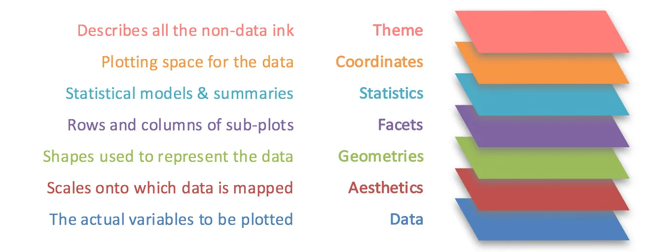
ggplot2 follows the “grammar of graphics”
- Theoretical framework for creating data visualizations
- Breaks the process down into separate components:
Data
Aesthetics (aes)
Geometric Objects (geoms)
Faceting
Themes
Grammar of Graphics
ggplot2 cheatsheet
ggplot2 syntax
There is a basic structure to create a plot within ggplot2, and consists of at least these three things:
- A Data Set
- Coordinate System
- Geoms - visual marks to represent the data points
In R it looks like this:
ggplot2 syntax
Let’s start with a basic figure with palmerpenguins
First we will define the data that we are using and the variables we are visualizing
What happens?
We forgot to tell it what to do with the data!
Need to add the appropriate geom to have it plot points for each observation
Note: the geom_point() layer will inherit what is in the aes() in the previous layer
Adding in Color
Maybe we would like to have each of the points colored by their respective species
This information will be added to the aes() within the geom_point() layer
Including a fit line
Why don’t we put in a line that represents the relationship between these variables?
We will want to add another layer/geom
That looks a little wonky…why is that? Did you get a note in the console?
Including a fit line
The geom_smooth() defaults to using a loess line to fit to the data
In order to update that, we need to change some of the defaults for that layer and specify that we want a “linear model” or lm function to the data
Did that look a little better?
Individual fit lines
It might make more sense to have individual lines for each of the species instead of something that is across all
What did we move around from the last set of code?
Updating Labels/Title
It will default to including the variable names as the x and y labels, but that isn’t something that makes sense. Also would be good to have a title!
We add on another layer called labs() for our labels (link)
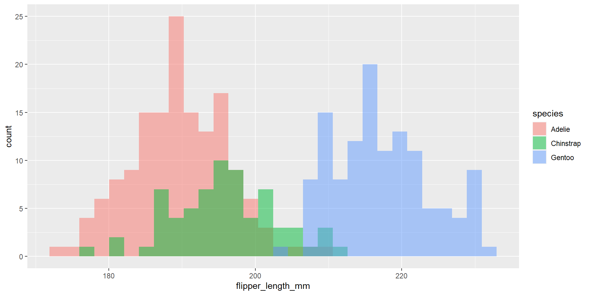
Penguin Histogram
Taken from the website for palmerpenguins (link)
Example 2
I have uploaded three datasets. I would like us to explore the datasets together to see what is going on with them.
The Three Datasets
Code
data1 <- import("https://raw.githubusercontent.com/dharaden/dharaden.github.io/main/data/data1.csv") %>%
  mutate(dataset = "data1")

data2 <- import("https://raw.githubusercontent.com/dharaden/dharaden.github.io/main/data/data2.csv") %>%
  mutate(dataset = "data2")

data3 <- import("https://raw.githubusercontent.com/dharaden/dharaden.github.io/main/data/data3.csv") %>%
  mutate(dataset = "data3")
We need to combine them together just to make things easier:
Descriptive Stats on the 3
Code
# A tibble: 3 × 6
  dataset mean_x mean_y std_x std_y  cor_xy
  <chr>    <dbl>  <dbl> <dbl> <dbl>   <dbl>
1 data1     54.3   47.8  16.8  26.9 -0.0641
2 data2     54.3   47.8  16.8  26.9 -0.0683
3 data3     54.3   47.8  16.8  26.9 -0.0645
Visualize the datasets
Create a scatterplot for each of the datasets
But I didn’t talk about how to do that for multiple datasets…
Check out ChatGPT
Try it out on data
Take a look at the data that we have been using and try making various visualizations for two of the variables
Next time…
- ANOVA!